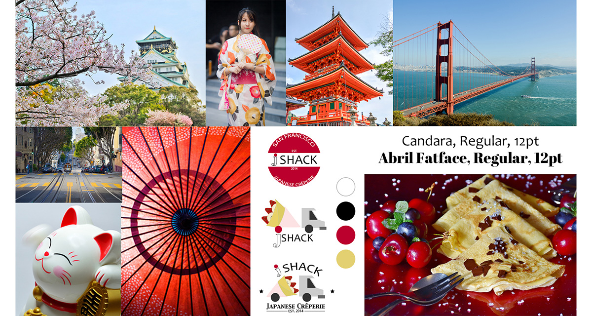
PROJECT DETAILS: This was a college project. We were asked to look up existing logos for local food trucks in San Francisco, California, and tasked with rebranding one of them. I chose a logo created for a popular Authentic Japanese Crêperie food truck--jSHACK.
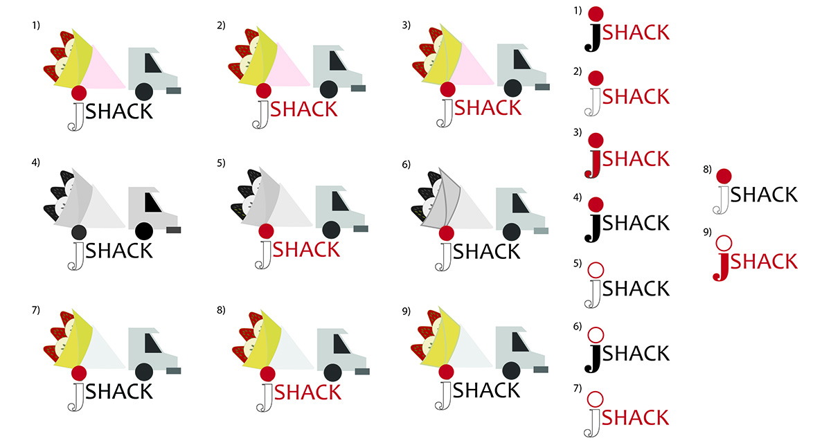
CHALLENGES & SOLUTIONS: The first pass of my revised logo included an actual food truck drawing in which the truck bed was a crêpe which can be seen in more detail on my moodboard and within the style guide (slides 3 and 4), but the feedback I received didn't match up to how I envisioned the logo to come across: "fun", "childish", "cute", "too detailed", none of which I was going for with my design.
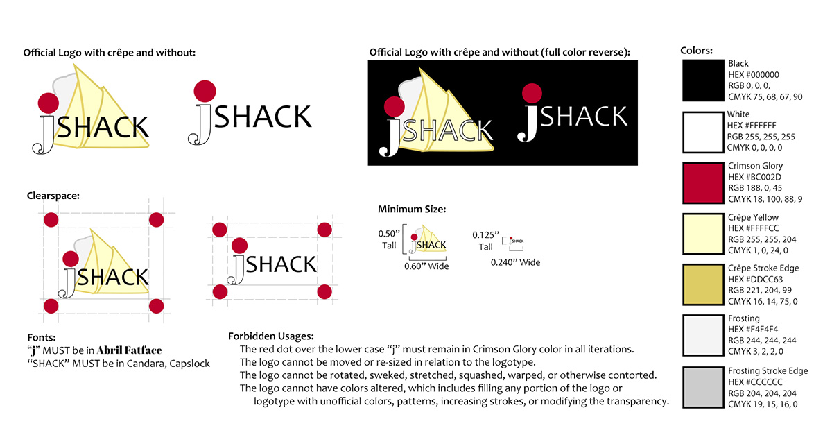
I decided to scrap the food truck symbol and switch to just the crêpe design, simplify the color scheme, and put the focus on the company's name. The image of the crêpe was sketched out then recreated as a vector design in Illustrator. I paired it with fonts that worked well and are easy to read in both small and large formats. The logo needed to pay attention to hierarchy and flow, which begins with the red dot of the "j" (colored "Crimson Glory" the official color of the red within the Japanese flag) and continues through the name of the food truck. This final design was met with high praise and much more positive feedback including words like: "professional", "easy to recognize", "great hierarchy", and "perfect".
As extra credit we got to design some merchandise that our chosen food truck could potentially sell with our new logo. I chose keychains (something fun for a food truck to sell), aprons, and t-shirts. I also created an updated business card for jSHACK.
SKILLS/PROGRAMS USED: Adobe Illustrator, Adobe Photoshop, mouse and trackpad.