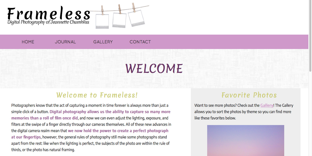
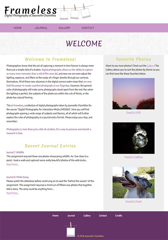
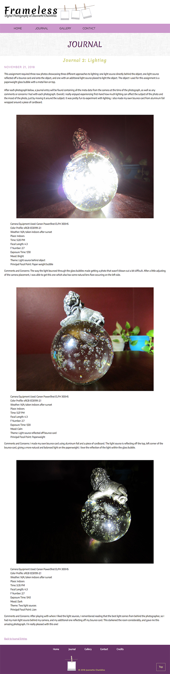
PROJECT DETAILS: Frameless was created for my Digital Photography college course. The only requirements were that the website must house all the specs of each photo and must have a photo gallery that was sortable by photo project. Though some of my peers utilized existing photo gallery websites (Flickr, or DeviantART), I decided to hand-code my own website, which became Frameless. I also decided to keep a journal of each photo project and added these to my website to make it really stand apart from the rest of the class.
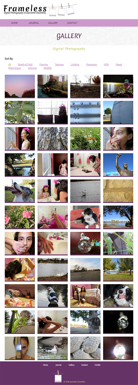
CHALLENGES & SOLUTIONS: This digital photography website needed to be responsive in design as well as have a strong support system for viewing many images at once. All images needed to appear as thumbnails and also as full-sized images, and all needed to load quickly. I knew from the start that it was going to be a very image-heavy website.
In order to assist with organizing and categorizing of all images, JavaScript was used to code a MixitUp plugin which was used for the interactive gallery feature. All thumbnails were saved as JPG files, and all original photos were saved as PNGs which helped the site load quickly. Each page paid close attention to image sizes and overall loading times. This website is also fully responsive and can be easily viewed on a mobile device or tablet.
SKILLS/PROGRAMS USED: All images featured on Frameless were captured, edited, and/or drawn by myself (including the site logo), and are copyright © Jeannette Chambliss. I hand-coded all of the programming for this site in Adobe Dreamweaver using HTML5, CSS3, JavaScript, jQuery, and PHP (with the exception of the MixitUp plugin code, which was sourced online).